Language: English
Format: 26 cm x 34 cm
Release date: 2016
ca 128 pages
ISBN 978-3-95985-217-3
Hardcover
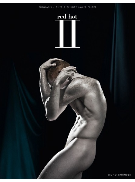
"“Red Hot II” is a collaboration between British photographer Thomas Knights and British designer Elliott James Frieze, characterized with its rebranded midnight blue material background. “I felt there was more to say. Many of the redhead models we talked to not only had issues with their red hair growing up, but also with being pale. So this exhibition and art book will explore the beauty of the redhead’s pale skin, its supposed fragility, and poetic appearance ... We will also look at the beauty of freckles as well as black and mixed-race redheads. We are taking the conversation further this time, celebrating what makes us redheads unique, learning to love that uniqueness and empowering ourselves by owning that difference,” says Thomas Knights, creator of the “Red Hot” project. As with his previous book, “Red Hot 100,” this publication serves a good cause. The charity partner for the book is The Diana Award anti-bullying initiative. Princess Diana is a globally recognized household name, and Knights already has a strong relationship with the charity with proceeds from the original “Red Hot 100” book totaling over £10,000 to date. (The “Red Hot” project has raised over £45,000 in total for various charities and good causes.) The new look of “Red Hot” will keep the core message of the original “Red Hot”: redefining the “ginger stereotype” with a strong anti-bullying message. But this time, the focus of the conversation will celebrate what makes redheads unique, with a focus on pale skin, freckles, black, and mixed-race redheads. Unlike the original “Red Hot 100” book, which focused more on quantity, “Red Hot II” will scale back the number of models, focusing on slightly fewer that suit this new luxury aesthetic and turning the attention more on their individual story and unique look. This will mean the viewer can really explore their unique experience. Thomas Knights and Elliot James Frieze have scoured the world to bring you the hottest redheads from Europe, the Americas, the Middle East, and Australasia. One of the most successful elements of the “Red Hot” project was the personal quotes next to each image. This fundamental part of the project will return to “Red Hot II,” as the project creators encourage their models to go deeper into their past and share more of their stories with them. Enlightening, heart-warming, poetic, funny or sad—the quotes give the viewer a unique perspective on what it is to grow up a redhead in the twenty-first century. The foreword is written by Jacky Harvey Collins, art historian and writer of the critically acclaimed “Red—A History of the Redhead” The background image takes on an alluring luxe midnight blue satin allowing for pale skin to be explored in a way the bright original blue didn’t. The midnight blue and updated logo will be rolled out across all products, exhibitions, and literature, so there is a clear change in brand identity for existing fans and total continuity. The project will take on a more refined, high-end fashion and aspirational design look and feel. Pale skin will be the new focus alongside auburn hair. It will be enhanced by the lighting in all photography so to appear pale like a statue—placing the models on a pedestal and poses reminiscent of Graeco-Roman Gods: heroic and strong, but also with a poetic fragility. The “Red Hot” motto is “Be proud of who you are.” This mission statement goes beyond only speaking to redheads. It’s about celebrating difference. Championing an alternative view of beauty. It’s empowering, owning one’s own perceived flaws and celebrating difference. In the West, we live in a tan culture. The idea of being tanned (either real or fake) is seen as desirable, aspirational, and attractive. No matter the health risks associated with tanning, being “tall, dark, and handsome” and having a “healthy glow” is what we are told is attractive. If you can’t tan, you are often ridiculed and are made to feel less attractive by your peers and society as a whole. However, this notion of a tan looking “more attractive” has been learned. It is a result of a modern fixation with summer holidays and leisure time defining our social standing. More holidays equals more leisure time equals a higher social standing. “Tan” becomes synonymous with “attractive.” It wasn’t long ago that it meant the opposite—you were of a lower perceived social standing if you were tanned, as it meant you were poor and had to work outside; back then, pale skin was seen as aspirational. We think we are in control of what we find attractive and what we think is “beautiful”—but this couldn’t be further from the truth. Beauty is taught to us. Our innate desires have been manipulated by big business who realized a lot of money could be made from making us feel unattractive and “less than.” In the West, we are sold the dream of having a tan, and the East (especially in India and China) are sold the dream of being pale skinned—skin bleaching products exist, just in the same way as tanning products do in the West. Essentially, we are made to feel that what we are, is not good enough, and we are sold products to fix a created problem. “Red Hot II” will be celebrating pale skin and freckles alongside red hair. It is another step against the norm, and cements “Red Hot” as a brand unafraid of championing alternative views of beauty and our unique core message: “Be proud of who you are.”
Data sheet